In a world of digital fonts and instant design tools, calligraphy might seem like a relic of the past—but in branding and localization, it’s anything but.
From ornate Arabic script gracing perfume packaging to the delicate brushstrokes of Kanji in luxury branding, calligraphy continues to influence how global consumers perceive elegance, authenticity, and cultural value.
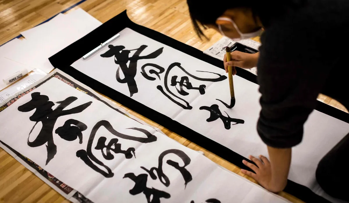
Calligraphy as a Cultural Signature
Calligraphy is more than just handwriting—it’s a visual language deeply tied to cultural identity. In many languages and regions, the style of writing conveys as much meaning as the words themselves.
For instance:
- Japanese and Chinese calligraphy evoke heritage, discipline, and refinement, often used in luxury branding, martial arts products, or tea packaging.
- Arabic calligraphy, with its fluid and geometric beauty, symbolizes sacredness, elegance, or tradition, and is frequently used in high-end goods and cultural tourism.
- South Asian scripts, like ornate Devanagari or Tamil calligraphy, are employed in festival promotions and celebratory contexts, emphasizing vibrancy and richness.
For localization teams, these visual cues are as important as the translation. A perfectly accurate translation might still feel out of place if the visual styling doesn’t match the audience’s cultural expectations.
When Fonts Fall Short
Standardized fonts often fail to replicate the emotional weight of calligraphy. Digital typography may be fast and scalable, but in many markets, it lacks the intimacy and authenticity of hand-drawn script.
Take for example, a global cosmetics brand launching in Thailand. A localized version of the logo in Thai might be technically correct—but if it uses a sterile, sans-serif font, it may not connect emotionally with Thai consumers who are used to graceful, curved letterforms in celebratory or premium contexts.
That’s where calligraphy comes in—not just as a decorative flourish, but as a design decision that enhances cultural alignment. For certain markets and campaigns, working with native calligraphers or type designers can help elevate the final product beyond translation into true transcreation.
Calligraphy’s Role in Shaping Perception
Visual aesthetics vary across cultures. What looks elegant in English (e.g., a delicate serif font) may not have the same connotation in Burmese, Hindi, or Korean. Calligraphy offers an adaptable, culturally grounded alternative that communicates the right kind of elegance or authority in each language.
For example:
- In Korean, modern Hangul calligraphy styles might be used in wellness products to create a soft, trustworthy tone.
- In French or Italian, classical calligraphy nods to heritage and tradition—ideal for gourmet or artisanal products.
- In Southeast Asia, handwritten-looking scripts often connote celebration, spirituality, or luxury—elements critical to tone in festival campaigns or heritage branding.
⸻
Case Studies: Calligraphy in Action
- Shang Xia (China/France)
Shang Xia, a luxury lifestyle brand founded by Hermès in collaboration with Chinese designers, incorporates Chinese calligraphy into its branding and packaging. Rather than default to Western-style typography, the brand leans into brush-style Chinese characters, reinforcing its cultural authenticity while blending modernity and heritage.
- Al Haramain Perfumes (Middle East & Asia)
Known for its global presence, Al Haramain uses intricate Arabic calligraphy on packaging and marketing materials. Even when localizing for Southeast Asian or Western markets, the brand retains its signature Arabic calligraphic style as a visual anchor of luxury, heritage, and religious significance.
- Ghibli Museum (Japan)
The Ghibli Museum in Tokyo uses hand-drawn Japanese calligraphy on signage, posters, and tickets. For international visitors, translations are provided—but the Japanese calligraphy is preserved to maintain the whimsical, nostalgic tone of Studio Ghibli’s brand. This shows how calligraphy can convey mood even when it’s not read by all.
- Diwali Campaigns by Global Brands (India & Diaspora Markets)
Brands like PepsiCo, Google, and Coca-Cola have incorporated festive Devanagari or Tamil calligraphy into their seasonal packaging during Diwali. These stylized scripts aren’t just translations—they tap into the aesthetic codes of celebration familiar to the Indian audience.
A Case for Reviving Calligraphy in Localization
As localization grows to include not just text but visuals, tone, and brand voice, there’s a strong case for giving calligraphy a renewed place in strategy. By collaborating with script specialists or cultural designers, localization teams can ensure that their visual storytelling carries the same cultural depth as the translated copy.
Calligraphy is not dead—it’s just waiting to be reinterpreted. For brands that want to go beyond translation and into meaningful, resonant communication, calligraphy may be the most human way to localize the written word.